Goals:
By following along with this document, you will know how to:
- Read and interpret basic code in {ggplot2}’s grammar of
graphics
- Initialize a plotting field using
ggplot()
- Map x and y aesthetics to a plot’s axes using
aes()
- Generate histograms with
geom_histogram() - Generate boxplots and stratified boxplots with
geom_boxplot() - Create titles and axis labels with
labs() - Save a plot with
ggsave()
Basically, this help document will provide you with the tools necessary to complete the labs for GLHLTH 705.
External resources
If you’re interested in going one level deeper, we highly recommend you check out the following resources, which will give a better introduction to {ggplot2} than we ever could (also why we’re plugging these at the top).
As R rule of thumb, it’s good to have multiple mediums of exposure to the same idea. We recommend you pick the one that suits your learning style and come back for more later:
For the visually inclined: RFun, Visualization with ggplot2 with John Little
John Little is nothing short of the world’s best librarian.
For the linguistically inclined:
R for Data Science, Chapter 3, by Hadley Wickham
After a preface and introduction, this is the first actual chapter in R4DS. The rationale is that {ggplot2} is actually pretty fun and satisfying to use. It’s pretty well guaranteed to have you hooked if you give it a chance.
For the theoretically inclined:
“A Layered Grammar of Graphics” by Hadley Wickham
Published in the Journal of Computational and Graphical Statistics, 2010
For the obsessively inclined:
ggplot2: Elegant Graphics for Data Analysis, by Hadely Wickham
**cough** Also by Hadley Wickham. (look it up using the Duke Library search engine and log in with your Duke credentials
For the listically inclined:
Reference page of ggplot2 commands
Core competencies for 705 lab
For those of you who made it through that onslaught of links without clicking on a single one, welcome to the Core Competencies section. We hope that this section is somehow dry enough that you go and find your answers in one of the resources above. But for those of you who are still feeling stubborn:
Create a new ggplot with
ggplot()
To initialize a plotting space, we first need to tell R that we want
to use ggplot. If we just call ggplot() and run it without
any data, we get a blank field. This is our sandbox:
ggplot()

Add a dataset to the plot
For this example, we’ll use the dataset available in base R called
iris, which provides measurements and species data on a
bunch of – you guessed it – irises.
| Sepal.Length | Sepal.Width | Petal.Length | Petal.Width | Species |
|---|---|---|---|---|
| 5.1 | 3.5 | 1.4 | 0.2 | setosa |
| 4.9 | 3.0 | 1.4 | 0.2 | setosa |
| 4.7 | 3.2 | 1.3 | 0.2 | setosa |
| 4.6 | 3.1 | 1.5 | 0.2 | setosa |
| 5.0 | 3.6 | 1.4 | 0.2 | setosa |
| 5.4 | 3.9 | 1.7 | 0.4 | setosa |
We can add the dataframe to our plot by including it in the argument
data =.
Superficially, this doesn’t change our output:
ggplot(data = iris)

But the data frame is now a part of the plot. One way to verify this
is by assigning the two previous plots a name and inspecting their size
with object.size(). The plot with the data should be
bigger:
without_data <- ggplot()

object.size(without_data)
#> 3720 bytes

with_data <- ggplot(data = iris)

object.size(with_data)
#> 10704 bytes
Assign x and y aesthetics
with aes():
Next, we need to tell ggplot which variables we’re working with, and
where to put them (their “aesthetic mapping”). We do this using the
argument aes(x = variable1, y = variable2)
If we’re creating histograms and singular boxplots, we only require a single variable on the x-axis. We can initialize it as follows:
See how ggplot assigned Sepal.Length to the x axis?
Create a histogram with
geom_histogram()
Okay, let’s cut to the chase. We want a plot.
{ggplot2} has a large number of plotting types and styles. Given the
types of variables we’ve mapped to ggplot’s aesthetics, all we need to
do is choose a type of plot appropriate for that type of variable, and
add it as a new layer with +
ggplot(data = iris, mapping = aes(x = Sepal.Length)) +
  geom_histogram()
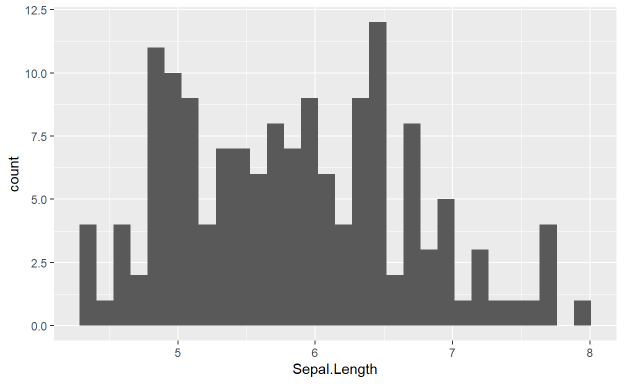
Many plots also allow us to add color with the argument
aes(fill = "colorname") (colors are always written as
strings, in quotes!).
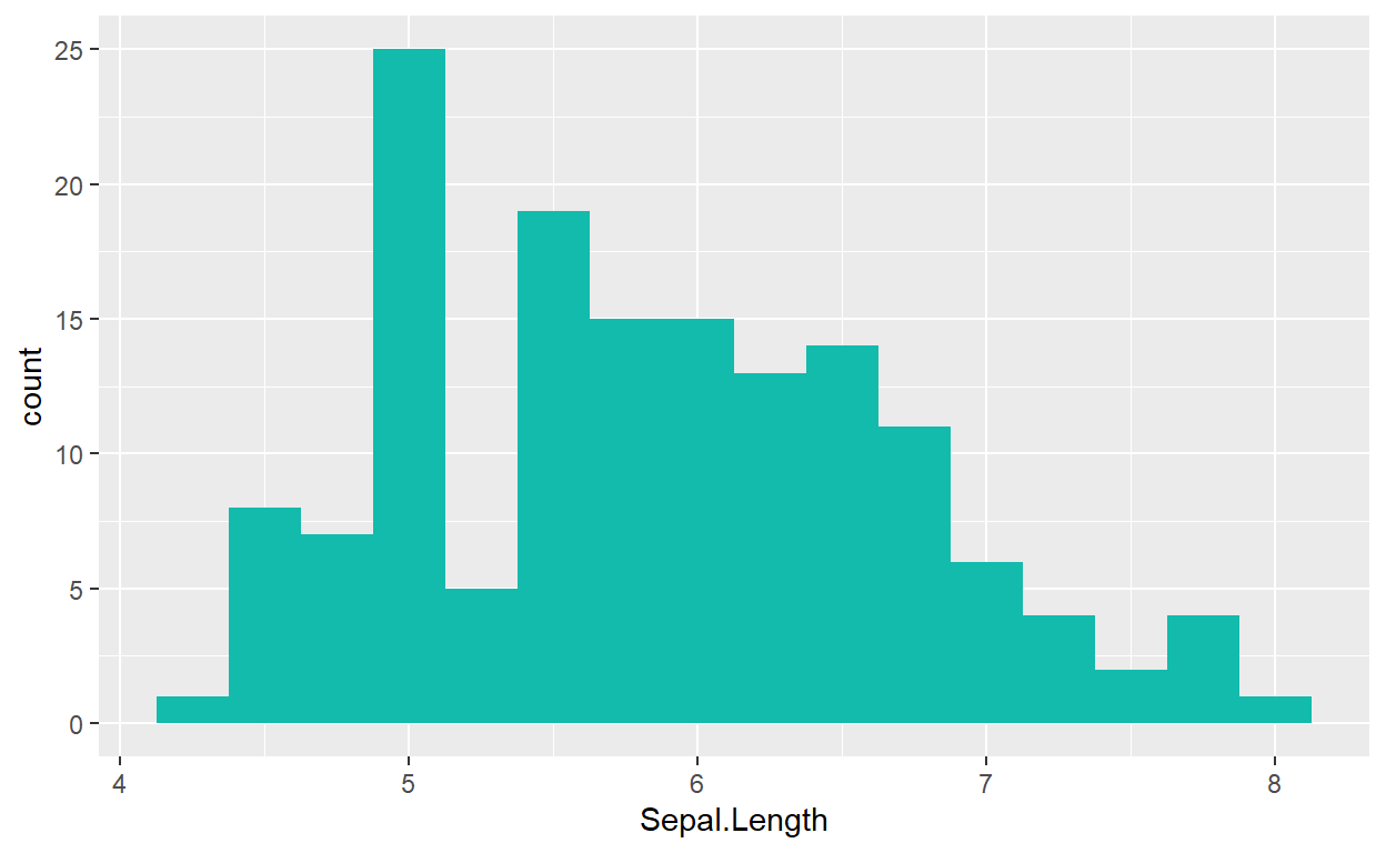
We may also change the size of our bins with argument
binwidth = x:
ggplot(data = iris, mapping = aes(x = Sepal.Length)) +
  geom_histogram(fill = "#12BBAC", binwidth = .25)
Create a boxplot with
geom_boxplot()
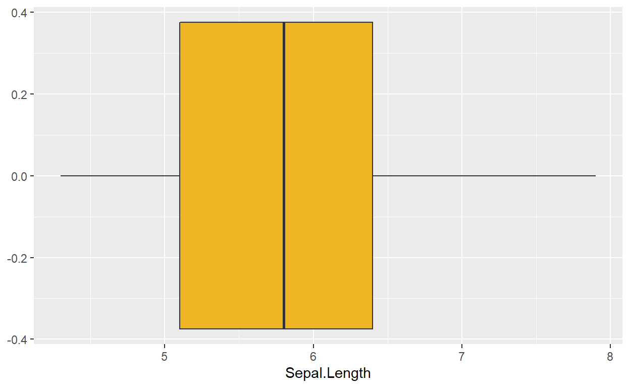
A single boxplot functions in the same exact manner. Instead of
geom_histogram(), we add a boxplot layer with
geom_boxplot(). This time, I’ve used a default
color name, goldenrod2, instead of a hexadecimal color
code:
ggplot(data = iris, mapping = aes(x = Sepal.Length)) +
  geom_boxplot(fill = 'goldenrod2')
Generate a stratified boxplot by adding a y aesthetic:
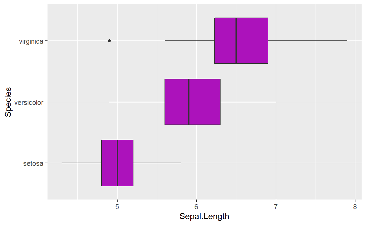
We can create multiple boxplots within a single plot by adding a
categorical variable as a second aesthetic. The iris
dataset contains a categorical variable, Species, which
would be appropriate for this task:
ggplot(data = iris, mapping = aes(x = Sepal.Length, y = Species)) +
  geom_boxplot(fill = '#AC12BB')
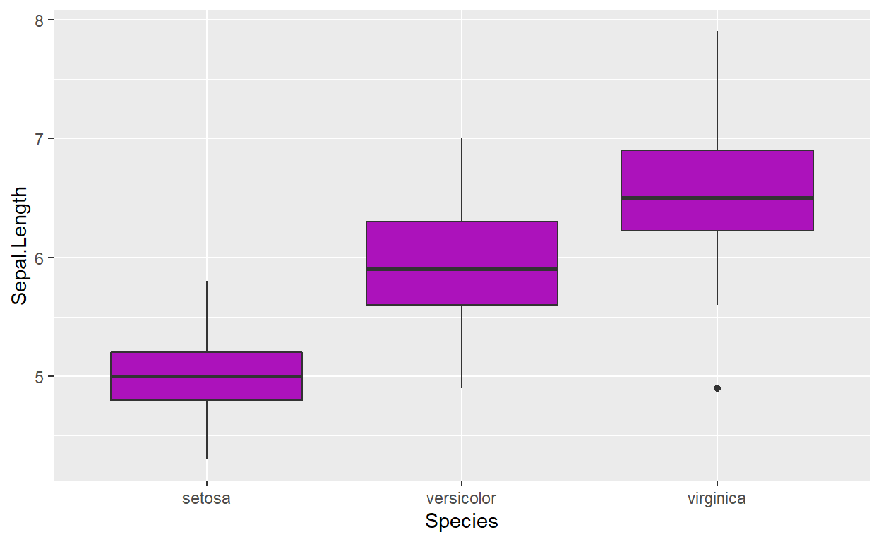
We can also display the boxplots vertically by assigning
Sepal.Length to y = and Species
to x = :
ggplot(data = iris, mapping = aes(y = Sepal.Length, x = Species)) +
  geom_boxplot(fill = '#AC12BB')
Create titles and axis
labels with labs()
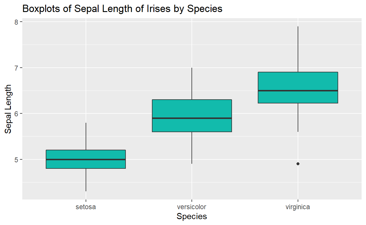
Finally, we need to make our plots fit for public use… it needs axis
labels and a title. We can specify these by adding another layer to our
plot, labs(). Make sure you write your labels as
strings:
ggplot(data = iris, mapping = aes(y = Sepal.Length, x = Species)) +
  geom_boxplot(fill =  "#12BBAC") +
  labs(x = "Species",
       y = "Sepal Length",
       title = "Boxplots of Sepal Length of Irises by Species")
BONUS:
Generating multiple stratified plots with facet_wrap() or
filter()
You might be wondering what this sort of stratification might look life if we tried the same thing with a histogram. Can a histogram accept a y aesthetic? When we try and assign a second aesthetic to a histogram, we get the following result:
ggplot(data = iris, mapping = aes(x = Species, y = Sepal.Length)) +
  geom_histogram(fill = "goldenrod2")

#> Error: stat_bin() can only have an x or y aesthetic.
facet_wrap()
An easy way to generate stratified histograms is with the additional
layer, facet_wrap(), which takes a formula in the following
syntax:
. ~ stratifyingVariable
The period here represents our ggplot object. We put the stratifying
variable on the right side of the formula as a way to designate it as
the “independent variable” of sorts. The output, . ,
depends on whatever categorical we assign as our faceting
variable. In this case, the histograms dependson the variable
Species:
ggplot(data = iris, mapping = aes(x = Sepal.Length)) +
  geom_histogram(fill = "goldenrod2") +
  facet_wrap(. ~ Species) +
    labs(x = "Sepal Length",
         y = "Count",
         title = "Histograms of Sepal Length of Irises by Species")
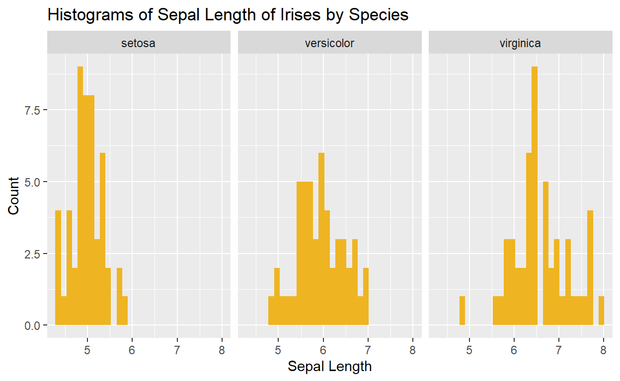
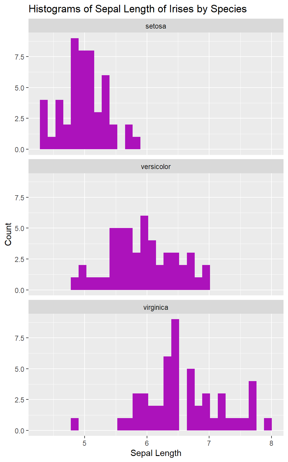
We might decide that we want the plots stacked vertically instead of
horizontally to help us better compare their distributions by Sepal
Length. We can do that too, with the argument nrow =:
ggplot(data = iris, mapping = aes(x = Sepal.Length)) +
  geom_histogram(fill = "#AC12BB") +
  facet_wrap(. ~ Species, nrow = 3) +
  labs(x = "Sepal Length",
       y = "Count",
       title = "Histograms of Sepal Length of Irises by Species")
pipe and filter()
What if we only want the Sepal Lengths for the species Iris virginica?
One way would be to use filter(), which we connect to
our ggplot using a pipe:
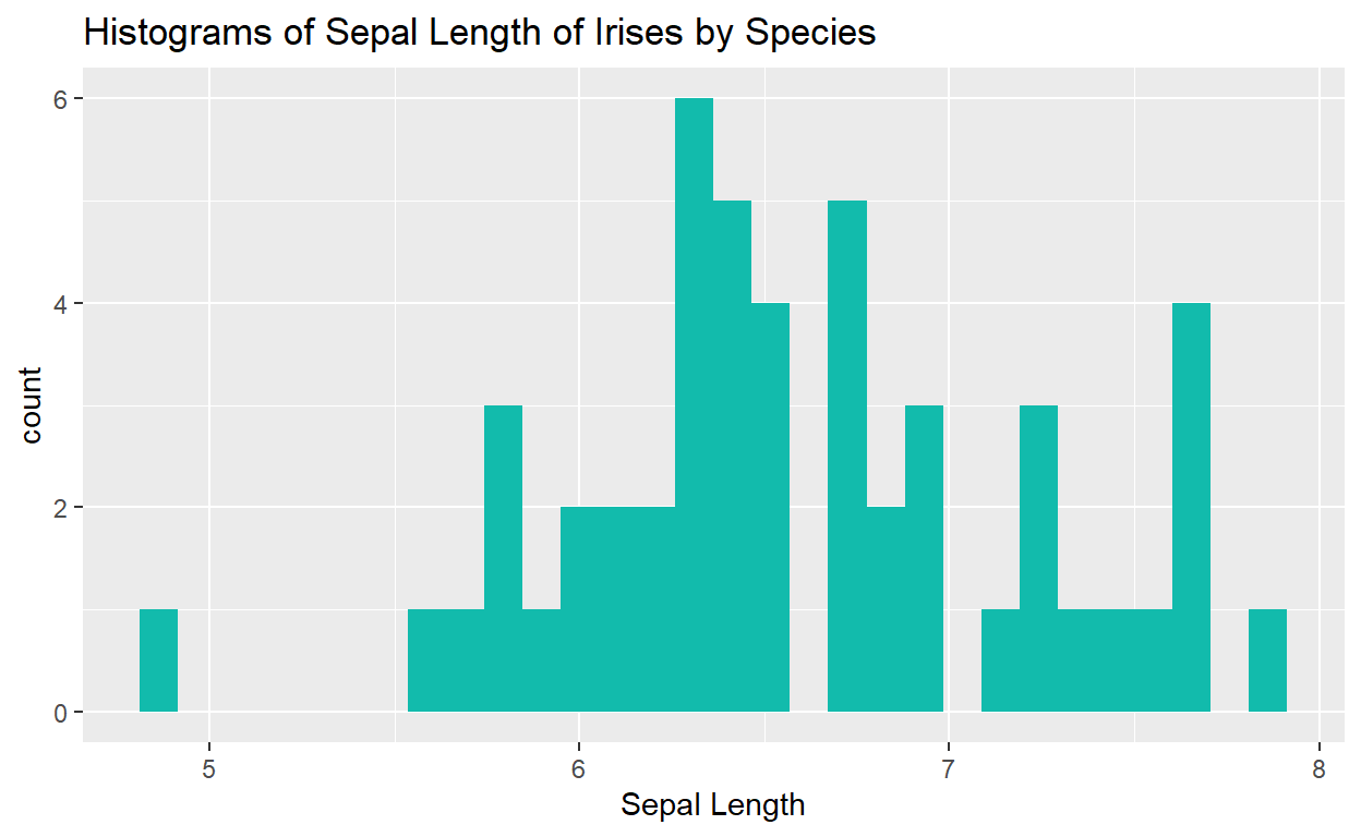
iris %>%
  filter(Species == "virginica") %>%
  ggplot(mapping = aes(x = Sepal.Length)) +
  geom_histogram(fill = "#12BBAC") +
  labs(x = "Sepal Length",
       title = "Histograms of Sepal Length of Irises by Species")
