LAB MATERIALS
R Markdown file for Lab 3 Click link to download. Fill it in with your answers to the following lab tasks. When you’re ready to submit, name it as
Lab3_FirstinitialYourlastname.Rmd, and submit it using the Sakai dropbox.Lab_3_kenya.rds - data file available on Sakai
Lab 3 Goals
Assess the bivariate relationships between outcome and covariables and the statistical association between each of the two variables
Estimate the epidemiologic measures of association (risk difference, risk ratio and odds ratio) between risk factors and outcome
Lab 3 Grading scheme
| Competency | Points |
|---|---|
| .Rmd file runs without error | 10 |
| Task 3 (Table 1) | 5 |
| Task 4 (Table 2) | 10 |
| Task 5 (Table 3) | 20 |
| Task 6 (stratified boxplots) | 10 (5 each) |
| Task 7 (short answer) | 5 |
| Task 8 (short answer) | 10 |
| Task 9 (short answer) | 5 |
| Task 10 (short answer) | 5 |
| Task 11 (short answer) | 20 |
| Total | 100 |
Task 1: Load libraries and dataset
For this assignment, we’ll need packages {tidyverse}, {skimr}, {epiR}, {tableone}, and {epiAssist}
For your data, you will use the dataset Lab_3_kenya.rds,
located in the Sakai Resources folder for this course. This has all of
the variables that we’ve created in labs 0, 1, and 2, and only contains
those observations in our closed cohort (n = 16,828).
Task 2: BIG PICTURE
Just think on this for a moment. Internalize it. Come back to it:
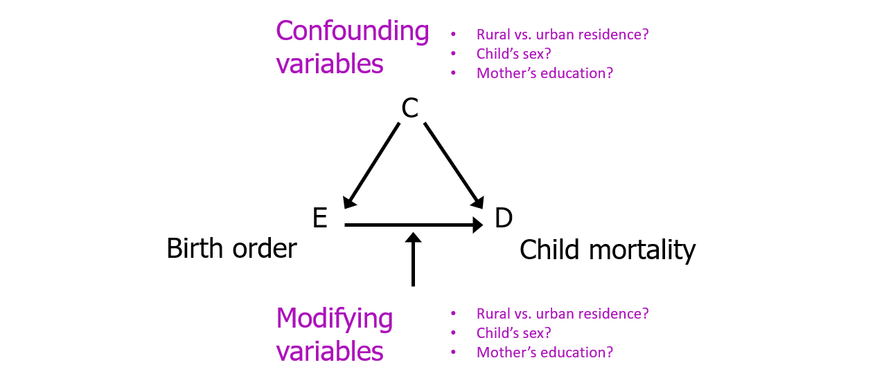
For this and subsequent labs, we are considering
- Child mortality within 5 years as our outcome (response)
variable
- Birth order >= 5 as the main risk factor variable and
- Other variables as potential confounders or modifiers of the relationship between mortality and birth order.
Task 3: Table 1
Tabular analysis of continuous variables by mortality status
INSTRUCTIONS: Fill in Table 1 with the
descriptive statistics for maternal BMI (mbmi) and maternal
age (mage), overall and by the two levels of child
mortality within 5 years (death).
This table also requires you to use R to calculate statistical tests
(T-test and Kruskal-Wallis) of the association between the outcome,
death, and maternal BMI and age (i.e., comparing the
distributions of maternal BMI and maternal age for the children who died
versus those who were alive).
Round p-values to 3 decimal places.
Read on for advice on how to generate overall and stratified summary statistics, as well as instructions for how to perform the two statistical tests.
Overall summary statistics for each variable variable
The skim() function provided by {skimr} makes this task a simple one. However, unlike previous labs where we ran a summary on the entire dataset, in this task we want individual variables. To keep your output clean, we recommend you generate your summary statistics only for the variables of interest.
We can use a pipe with skimr() to call specific variables, like this:
Stratified summary statistics
Since we’re already doing things in a pipe, we can use the filter
function to retrieve summary statistics based on mortality status. To
stratify by the variable death, we should add the
group_by() function to our pipeline, specifying that we
want to “group by death, then skim the variable
mbmi”:
Note: Table 1 asks for counts of records with mbmi
and mage data available vs. those missing, both overall and by the 2
levels of death (i.e. dead and alive). If you look closely,
this means that we need counts of counts of kids with data available on
mbmi and mage, overall, within levels of
death, and those missing values. skim() does not give you
raw counts of the variable death that account for those
missing values.
Use table() or a pipe, group_by() and
count() to get the counts of children in each group of
death (i.e. by levels of death). Then use the
column of your skim output, n_missing, to subtract missing
values from groups
T-tests and Kruskal-Wallis tests
T-tests and one of their nonparametric cousins, Kruskal-Wallis, can be used to compare means between between groups (i.e. between sub-populations), with the null hypothesis (H0) being that all means are equal.
There are a few simple functions from the {stats} package that we can
use to manually run these tests. To implement, we use functions
t.test() and kruskal.test(). Both take the
same arguments:
- A formula:
depVar ~ indepVar - A data frame
In this case, we are interested in knowing whether or not the means for mbmi and mage differ by strata of child mortality status, death.
What this means is that when we’re building our formula, the “y”/dependent variable (the resulting means), should be on the left, while the “x”/independent variable (a categorical stratifying variable), should be on the right.
Example of T-tests and Kruskal-Wallis
As an example, we might use the starwars dataset,
available through the {dplyr} package (in the tidyverse), to inspect the
body mass of different characters by gender. Let’s take a look at the
raw data:
| name | height | mass | hair_color | skin_color | eye_color | birth_year | sex | gender | homeworld | species |
|---|---|---|---|---|---|---|---|---|---|---|
| Luke Skywalker | 172 | 77 | blond | fair | blue | 19.0 | male | masculine | Tatooine | Human |
| C-3PO | 167 | 75 | NA | gold | yellow | 112.0 | none | masculine | Tatooine | Droid |
| R2-D2 | 96 | 32 | NA | white, blue | red | 33.0 | none | masculine | Naboo | Droid |
| Darth Vader | 202 | 136 | none | white | yellow | 41.9 | male | masculine | Tatooine | Human |
| Leia Organa | 150 | 49 | brown | light | brown | 19.0 | female | feminine | Alderaan | Human |
| Owen Lars | 178 | 120 | brown, grey | light | blue | 52.0 | male | masculine | Tatooine | Human |
Our formal question might look like this: “Does mean character height differ by a character’s gender?” (For the purposes of example, assume that the 83 characters are a sample from a large population of characters)
We can calculate summary statistics for sub-group frequency counts and means:
| gender | n | mean |
|---|---|---|
| feminine | 17 | 164.6875 |
| masculine | 66 | 176.5161 |
We can also visualize the respective distributions of
height by gender using density plots.
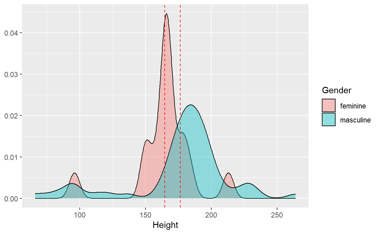
Our t-test would effectively tell us whether or not the observed difference in sample mean of height supports the conclusion that the population mean height is different between the two groups.
t.test(height ~ gender, data = starwars)

#>  Welch Two Sample t-test
#>
#> data:  height by gender
#> t = -1.5596, df = 37.315, p-value = 0.1273
#> alternative hypothesis: true difference in means between group feminine and group masculine
#> is not equal to 0
#> 95 percent confidence interval:
#>  -27.191682   3.534423
#> sample estimates:
#>  mean in group feminine mean in group masculine
#>                164.6875                176.5161
However, since the category for gender == 'feminine'
only contains 17 observations, we might decide that a nonparametric test
(one that doesn’t assume a normal distribution), might be more
appropriate for the small sample size. In this case we can use the
Kruskal-Wallis test:
kruskal.test(height ~ gender, data = starwars)

#> Kruskal-Wallis rank sum test
#>
#> data:  height by gender
#> Kruskal-Wallis chi-squared = 8.6845, df = 1, p-value = 0.003209
Notice the difference in the conclusion you would draw from either test. For the t-test, we should conclude that we cannot reject the null hypothesis, whereas the nonparametric test tells us that there is a statistically significant difference in the mean height of the two groups.
Tabular
analysis of categorical variables by death
INSTRUCTIONS: Table 2 contains three
distinct columns for frequency counts and percentages.
The first, “All Children” requires the overall frequency counts and percentages by the categorical variables of interest. These are the same values that you generated for Table 1 in both labs 1 and 2.
The next two columns, “Dead” and “Alive”, require frequency counts
and percentages of each of the variables of interest, stratified by
mortality status at 5 years, death. Be sure to calculate
percentages only for the non-missing values and round percentages to 1
decimal place.
This table also includes statistical measures (Chi-Sq and Fisher’s exact test) of the association between mortality status and the variables in the table.
Round p-values to 3 decimal places.
{tableone} package
We will complete this task by first using the package {tableone}, a powerful tool for tabular analysis, especially for stratified analyses like this one.
The function CreateTableOne() will create a {tableone}
object that generates mean and standard deviation for continuous
variables, and frequency counts and percentages for factor
variables.
CreateTableOne() requires several arguments of central
importance for it to run:
1.) vars = - a vector of variable names, written as
strings
2.) strata = - a categorical variable for stratifying (if
desired)
3.) data = - your data frame
4.) factorVars = - used to convert character variables to
factors on the fly
Create a vector of variables
For starters, we’ll need a vectorized list of our variables of interest, written as strings (in quotes).
As an example, we might use the derived variables in our kenya
dataset for size and pnc. To make our code
more readable, we will create a vector object that contains both
variable names. To do this, we put both variable names in quotes,
separating them by commas within a vector, c(). Then we
need to assign the vector a name so that we can call it later. Here,
we’ve named the vector variables.
variables <- c('size', 'pnc')
Construct {tableone} objects
First, we will construct two different {tableone} objects: a “simple” table with univariate frequency counts, and a “stratified” table, with bivariate counts.
After that, we’ll use print() to view the output
generated by those two different objects.
Simple table
For a simple table of summary statistics, we only need to use
arguments vars = and data =. It’s best
practice to assign the {tableone} object to a name, so that we can use
it in a print() function in a moment.
simple_tab <- CreateTableOne(vars = variables,
                             data = kenya)
Stratified table
We may also want to stratify our results by a second variable, like
bord5.
stratified_tab <- CreateTableOne(vars = variables,
                                 data = kenya,
                                 strata = 'bord5')
Print table
We can then use a print() function, with arguments
specific to our {tableone} object, to view our simple and stratified
tables.
With categorical variables, it’s typically best to use the argument
showAllLevels = TRUE so that we see every category.
Print simple table
print(simple_tab, showAllLevels = TRUE)

#>              level                  Overall
#>  n                                   16828
#>  size (%)     Very large                26 ( 7.4)
#>               Larger than average       76 (21.7)
#>               Average                  158 (45.1)
#>               Smaller than average      65 (18.6)
#>               Very small                25 ( 7.1)
#>  pnc (%)      No prenatal care          15 ( 9.1)
#>               Received prenatal care   149 (90.9)
Print stratified table with chi-square test of independence
Whereas the simple table prints overall frequency counts and
percentages, our stratified table will take the stratifying variable (in
the case of this example, bord5), and perform a chi-square
test of independence for that stratifying variable and each of the
variables of interest e.g. of size and
pnc:
print(stratified_tab, showAllLevels = TRUE)

#>              Stratified by bord5
#>               level                  1-4 in Birth Order 5+ in Birth Order  p     test
#>  n                                   13263              3565
#>  size (%)     Very large                23 ( 9.3)          3 ( 2.9)        0.157
#>               Larger than average       51 (20.6)         25 (24.5)
#>               Average                  108 (43.5)         50 (49.0)
#>               Smaller than average      50 (20.2)         15 (14.7)
#>               Very small                16 ( 6.5)          9 ( 8.8)
#>  pnc (%)      No prenatal care           4 ( 3.7)         11 (20.0)        0.002
#>               Received prenatal care   105 (96.3)         44 (80.0)
Note that each row of the stratified results sum to the same result
as given by the column for “Overall” in our simple_tab.
As the default for categorical variables, the {tableone}
print() function performs a chi-square test of independence
between `bord5’ and each of the variables of interest.
There’s one glaring issue here, however: neither of our stratified variables meet the assumption of normality! Each contains at least one cross-tabulation with counts that are less than 5.
Fisher’s exact test of significance
When we look at our decision tree for hypothesis testing of categorical outcome variables, we might decide that we need to use a Fisher’s Exact test when our data doesn’t meet the assumption of all expected cell counts being at least 5 for a chi-square test of independence.
To do this in a {tableone} object, we just need to include
exact = TRUE in our print() function to
calculate a Fisher’s Exact test, the nonparametric equivalent of the
chi-square test of independence.
print(stratified_tab, showAllLevels = TRUE, exact = TRUE)

#>               Stratified by bord5
#>               level                  1-4 in Birth Order 5+ in Birth Order p      test
#>  n                                   13263              3565
#>  size (%)     Very large                23 ( 9.3)          3 ( 2.9)        0.141 exact
#>               Larger than average       51 (20.6)         25 (24.5)
#>               Average                  108 (43.5)         50 (49.0)
#>               Smaller than average      50 (20.2)         15 (14.7)
#>               Very small                16 ( 6.5)          9 ( 8.8)
#>  pnc (%)      No prenatal care           4 ( 3.7)         11 (20.0)        0.001 exact
#>               Received prenatal care   105 (96.3)         44 (80.0)
Although in this particular example we draw the same conclusions from the Fisher’s exact test as we do from the chi-square test of independence, this will not always be the case.
Task 5: Table 3
Risk Differences, Risk Ratios, and Odds Ratios
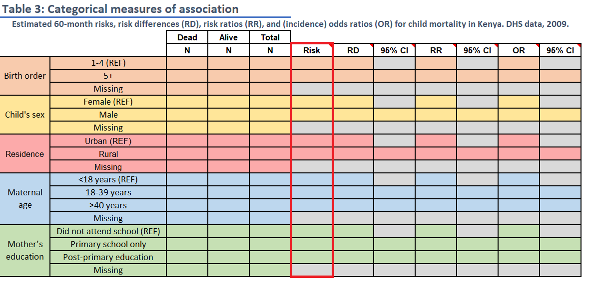
INSTRUCTIONS: Fill in Table 3 with
frequency counts overall and by levels of child mortality within 5 years
and with the stratum-specific risk of death (these are the same
frequency count values, N, as in Table 2). Then use
mAssoc() to compute the risk difference, risk ratio and the
odds ratio of death comparing levels for each of the 5 variables to the
reference level.
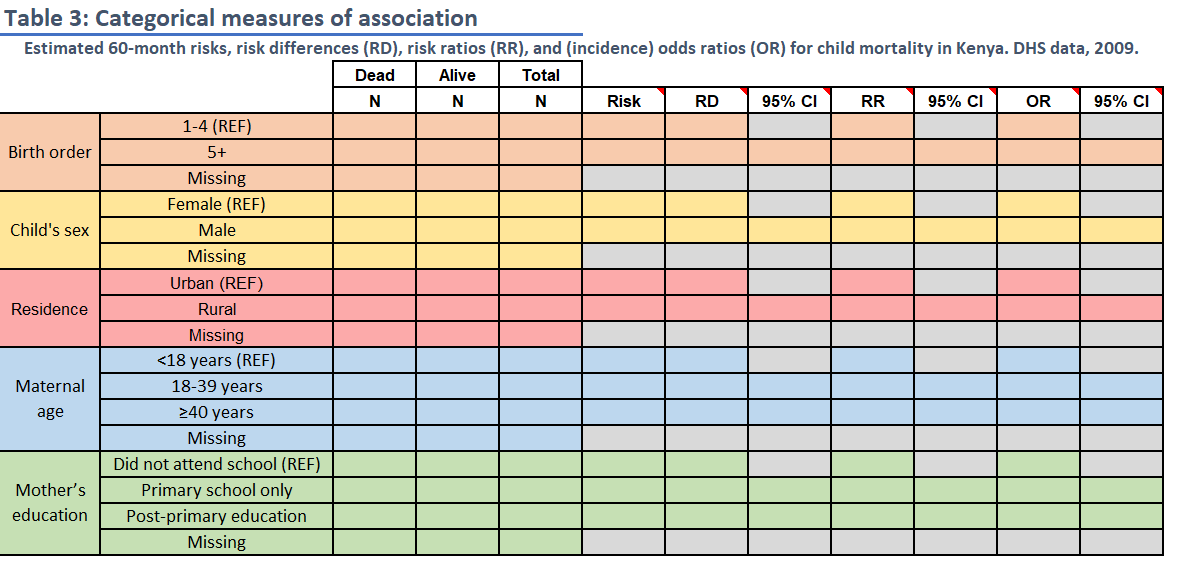
The reference level for each variable is noted in the spreadsheet (“REF”). For the two 3-level variables, calculate risk differences and ratios for each non-reference level relative to the reference level.
Round risks to 3 decimal places and ratios to 2 decimal places.
Take a deep breath.
Don’t let this table overwhelm you. We’re going to break it down step-by-step
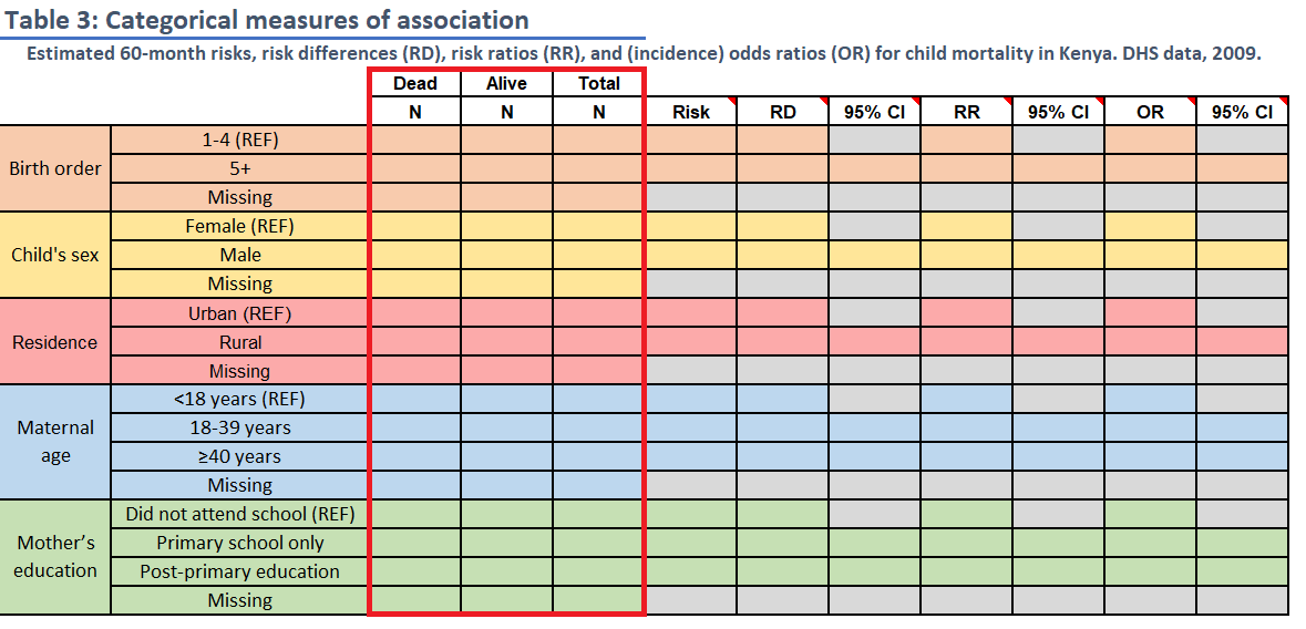
Frequency counts
The frequency counts in this table align with those generated for Table 2. Feel free to use Excel equations to transfer data from sheet 2 to sheet 3.
Risk
The value for risk should be calculated as the risk of the outcome of
interest (death == "Dead") according to each level of the
exposure. Risk should be reported as a proportion, rounding to the third
decimal.
Risk difference (RD), Risk Ratio (RR), and Odds Ratio (OR)
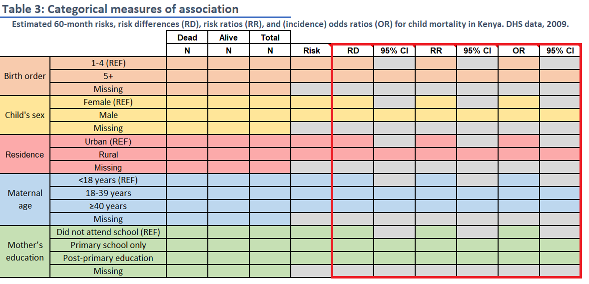
RD, RR, and OR are what are known as “measures of association” because they are used to compare outcomes between levels of a categorical variable. In epidemiology, we refer to the baseline level as the “reference level” and the comparator level as the “index level”.
In practical terms, for things like RRs and ORs, the index level goes in the numerator and the reference level goes in the denominator.
You can use your underlying knowledge of these measures of association to calculate our answers by hand and confirm the results that we’ll obtain using the functions that follow.
mAssoc() for
Measures of Association
For this task, we will use mAssoc() to generate all
three measures of association (RD, RR, and OR) in a singular output.
To use mAssoc(), we must take several steps to ensure
that our data is in the proper shape for our measures to be calculated
appropriately:
1.) Create a table object using table()
2.) Rearrange the table with flipTable() to put it in the
appropriate alignment for use by mAssoc()
3.) Submit our rearranged table to mAssoc().
mAssoc()’s main input is a table object arranged in the
following format:
#   -----------  ----------  ----------
#                Outcome +   Outcome -
#   -----------  ----------  ----------
#     Expose +   cell 1      cell 3
#     Expose -   cell 2      cell 4
#   -----------  ----------  ----------
As a way of demonstrating, we will use the variable
bord5, stratified by death to calculate our
measures of association.
Step 1: Create a table
object with table()
First, we need to generate a table object and assign it a name. Keep
in mind that we want our exposure variable (in this case,
bord5) along the left side of the table and our outcome
variable (death) at the top of the table.
tab_bord5 <- table(kenya$bord5, kenya$death)
tab_bord5

#>                      Alive  Dead
#>  1-4 in Birth Order 11809  1454
#>  5+ in Birth Order   3002   563
Step 2: Rearrange table
with flipTable()
Notice that mAssoc() takes a table object
with the cross-tabulation of outcome of interest (Outcome +) and
exposure of interest (Expose +) in the top-left cell:
#   -----------  ----------  ----------
#                Outcome +   Outcome -
#   -----------  ----------  ----------
#     Expose +   cell 1      cell 3
#     Expose -   cell 2      cell 4
#   -----------  ----------  ----------
If we refer to our tableof bord5 and death, we’ll notice that it
currently displays the inverse of the arrangement required by
mAssoc():
tab_bord5

#>                       Alive  Dead
#>  1-4 in Birth Order  11809   1454
#>  5+ in Birth Order    3002    563
That is, our tabulation of bord5 currently takes the following form, with “Outcome-” and “Expose-” in the top-left corner. We need “Outcome+” and “Expose+” in that corner:
#   -----------  ----------  ----------
#                Outcome -   Outcome +
#   -----------  ----------  ----------
#     Expose -   cell 1      cell 3
#     Expose +   cell 2      cell 4
#   -----------  ----------  ----------
To fix this, we can use flipTable(), assigning it back
to the same name for the table object:
tab_bord5 <- flipTable(tab_bord5)

tab_bord5

#>                      Dead  Alive
#>  5+ in Birth Order    563   3002
#>  1-4 in Birth Order  1454  11809
Generate measures
of association with mAssoc()
To generate our measures of association and their accompanying
confidence intervals, all we need to do is submit our rearranged table
to mAssoc(), specifying that our data is cohort data with
method = "cohort.count", and setting our confidence level
to 0.95 with conf.level = .95:
mAssoc(tab_bord5, method = "cohort.count", conf.level = 0.95)

#> MEASURES OF ASSOCIATION FOR:  5+ in Birth Order (index) vs.  1-4 in Birth Order (referent)
#> Point estimates and 95% CIs:
#> -------------------------------------------------------------------
#> Inc risk ratio                                 1.44 (1.32, 1.58)
#> Odds ratio                                     1.52 (1.37, 1.69)
#> Attrib risk in the exposed *                   0.05 (0.04, 0.06)
#> Attrib fraction in the exposed (%)            30.58 (24.05, 36.56)
#> Attrib risk in the population *                0.01 (0.00, 0.02)
#> Attrib fraction in the population (%)          8.54 (6.20, 10.82)
#> -------------------------------------------------------------------
#> Uncorrected chi2 test that OR = 1: chi2(1) = 62.125 Pr>chi2 = <0.001
#> Fisher exact test that OR = 1: Pr>chi2 = <0.001
#>  Wald confidence limits
#>  CI: confidence interval
#>  * Outcomes per population unit
Reading mAssoc()
output:
The output of interest from mAssoc() will be printed to
the console. You can find it by clicking on the area with a red square
around it in this screenshot:
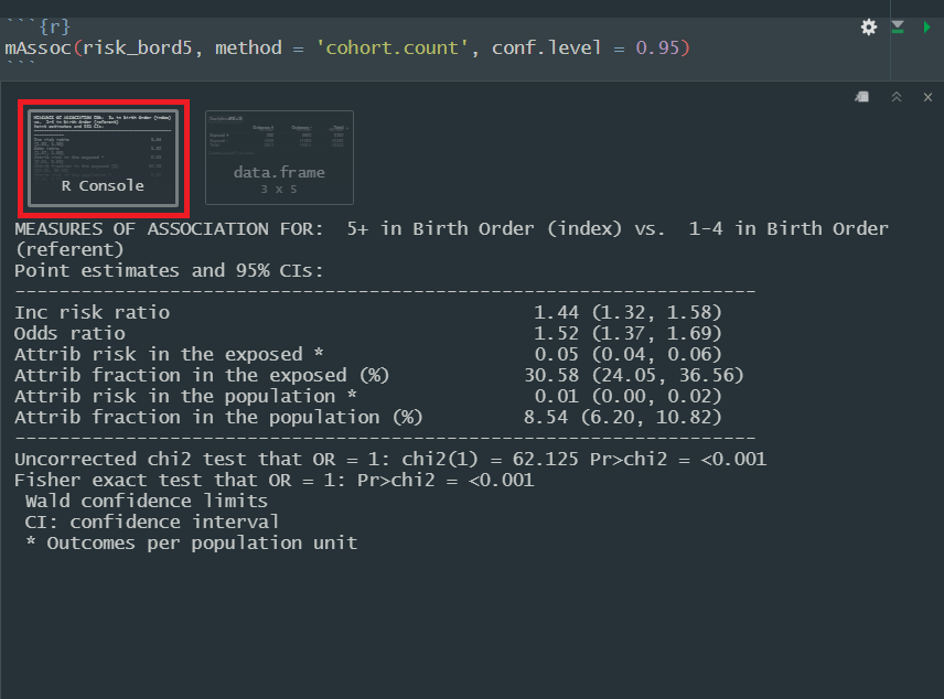
Here is a quick guide to the components of the output relevant to this activity:
Inc risk ratio: Our basic risk ratio
Odds ratio: Our basic odds ratio
Attrib risk in the exposed: The risk
difference. mAssoc() takes another argument,
units =, which by default is set to 1. This regulates our
output for the measure of risk difference.
mAssoc()
when exposure variable has 3+ levels
Now that you’ve seen the code for bord5 as an example,
if you’re paying close attention, you may have started to wonder, “But
what about variables like education, when there’s more than
one index level?”
Good news: flipTable() and mAssoc() are
designed to handle exposure variables with any number of levels. This
means that the steps you take for bord5, male,
and rural will also apply to magec and
education; simple as that.
Running mAssoc() when your exposure variable has 2+
levels will render multiple outputs for each respective index variable.
The person who wrote this function was even nice enough to label each of
those levels and whether or not they are the index or the reference
level.
Task 6: Side-by-side boxplots
INSTRUCTIONS: Generate boxplots of maternal BMI
(mbmi) and maternal age (mage), stratified by
levels of child mortality (death).
For this activity, we need boxplots that plot continuous variables
based on child mortality. In ggplot2, we can stratify boxplots by using
a second categorical variable when we specify our aesthetics
(aes()). In other words, if you set mbmi to
the y-axis, you can use a categorical variable, like death
as the variable on the x-axis.
Additionally, don’t forget to label your axes, give the plot a title,
and save it using ggsave()
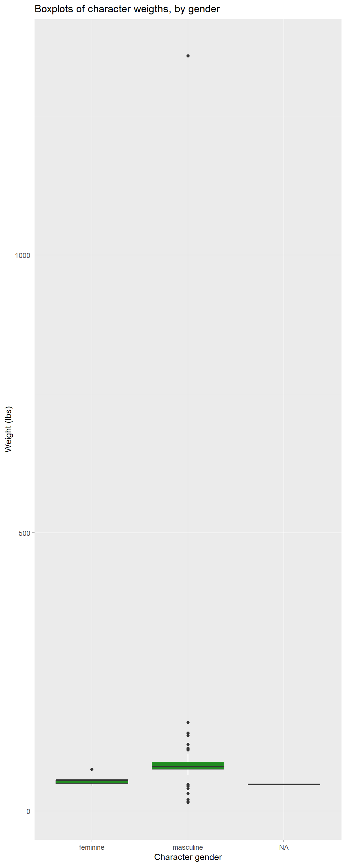
Here’s an example of what we are looking for, using the
starwars dataset. We’ve adjusted the dimensions a bit to
accommodate one lone outlier. Care to guess who it is?
Task 7: Short answer
For Table 1, what is the null hypothesis being tested for each the two variables. Do the two statistical tests agree? Is there a statistically significant difference in the distributions of either BMI or age by child mortality? Are there substantively/clinically significant differences in these distributions? If statistical and substantive differences disagree, why might that be the case?
Task 8: Short answer
For Table 2, what is the null hypothesis being tested for the variables. Do the two statistical tests agree? Is there a statistically significant difference in any of these bivariate distributions? Are there substantively/clinically significant differences in these distributions?
Task 9: Short answer
Age has been evaluated both as a continuous and categorical variable. Do the tests of association for these 2 parameterizations of age agree? If not, why not?
Task 10: Short answer
For Table 3, which risk factor has the strongest association with mortality? Provide a rationale for this assessment. Which factors are protective and which are harmful?
Task 11: Short answer
Prepare a brief paragraph describing and interpreting risk, RD and RR estimates (from Table 3) for the 60 month risk of death in association with birth order and maternal age.
Begin the paragraph by reporting the overall risk or proportion of deaths in the study population. Don’t just repeat numbers that are already shown in the table; note the values of effect estimates you feel should be highlighted, but otherwise describe the results in words. Write this paragraph as if you were including it in the results section of a manuscript. (175 words maximum).